
The pandemic highlighted a key issue: the chaos of modern life drove people to seek visual calm and genuine connections. Back to Basics recognized this need and aimed to encourage a slower, more mindful lifestyle.
Personas

Clara Monteiro
Age
39
Occupation
Interior Designer
Location
Lisbon
Bio
Clara has two kids and a very busy daily life, but she makes sure to slow down and practice slow living. She values self-care and spending time with her children. She looks for products and brands that have a real purpose and a true story, embracing the idea of "going back to basics." She prefers to buy just a few items, but they must be of high quality, with a simple design that never goes out of style.
Personality
Curious
Intelligent

Needs
- Find brands that share her values of caring for the planet, connecting with others, and living with purpose.
- Have an online shopping experience that is relaxing, inspiring, and easy.
- Feel an emotional connection with the brand through good storytelling.
Pain points
- Messy online stores with too much visual clutter or harsh colours.
- Brands that only care about selling and don't show clear values or build trust.
- Hard buying processes that make it difficult to see product details.

To embrace the essence of slow living is to cultivate a profound awareness of each fleeting moment.
Sofia Almeida
Age
27
Occupation
Content creator (Lifestyle)
Location
Porto
Bio
Sofia pays a lot of attention to how things look and to small details. She really likes clean, feminine, and nice-looking designs. She is always looking for products that make her daily life better and bring a sustainable feel to her routine. She shops online a lot and values websites that look perfectly clean and modern.
Personality
Extrovert
Organised

Needs
- Look through product lists in a clear and pretty way.
- See detailed photos and clear texts that help her imagine using the product in her own life.
- Connect with the brand's "soft but confident" voice.
Pain points
- Badly designed product pages that don't show how good the item is.
- Websites that look "cheap" or don't match the high quality of the products they sell.
- Not being able to easily find specific information about what she is buying.
A balanced life values wellness, embracing the small details that nurture your routine.
Colour palette
The colour system was built around natural, desaturated tones that echo the premium and feminine aesthetic of the Back to Basics brand.
Beige, sand, grey, and warm neutrals were chosen to create a soft yet confident tone, ensuring the interface feels elevated, approachable, and in tune with product line.
This restrained colour direction provide clarity across UI components, while reinforcing the brand’s minimal sophistication.
A muted palette crafted for
elegance and clarity.
Primary colours
Secondary colours
Typography
Montserrat
Aa
A modern calligraphy script known for its elegant and handwritten feel.
Designed by Dmitrii Chirkov
MoonTime
Aa
A typeface that balances elegance and function.
Designed by Julieta Ulanovsky, Sol Matas, Juan Pablo del Peral, Jacques Le Bailly
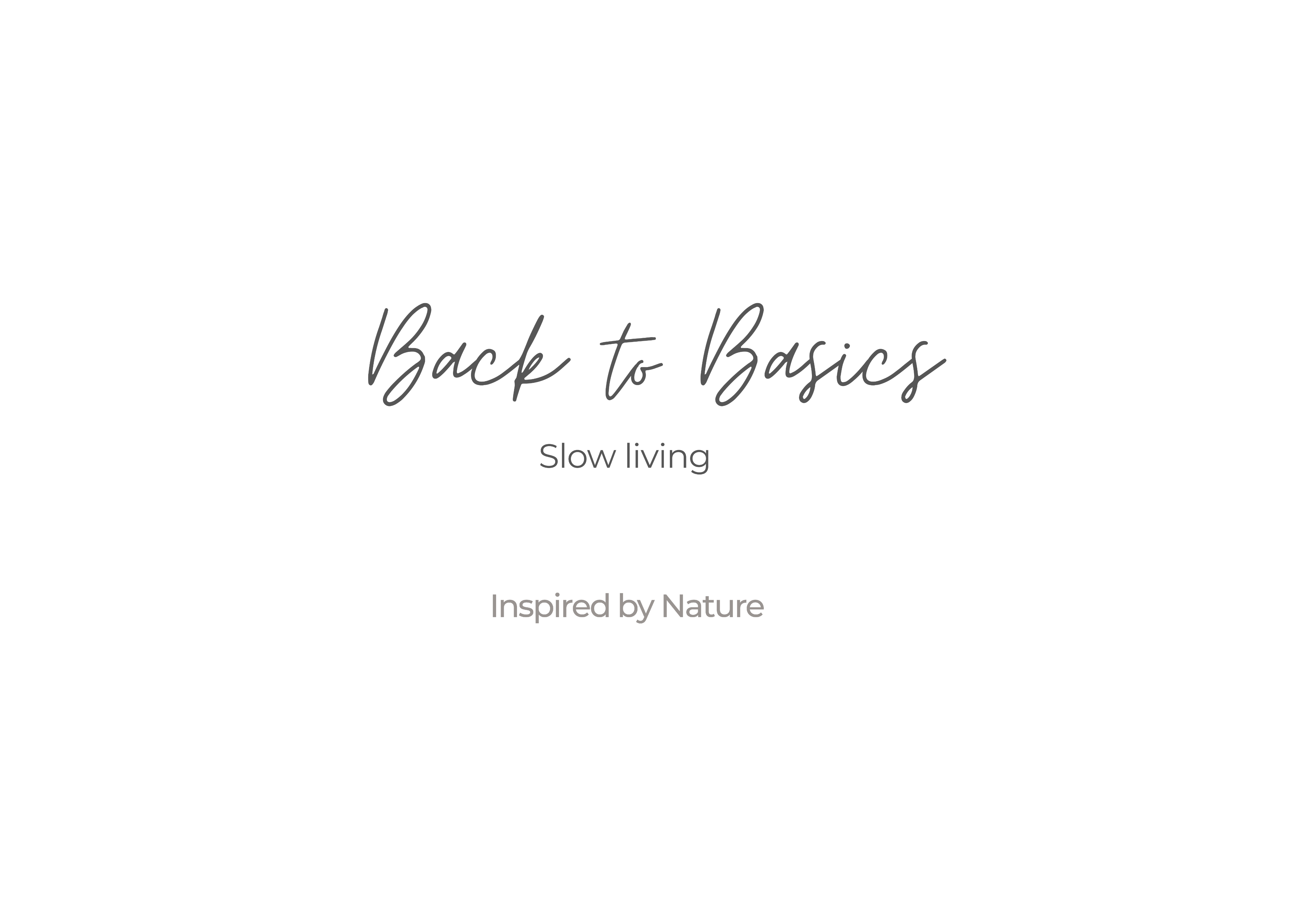
Visual identity
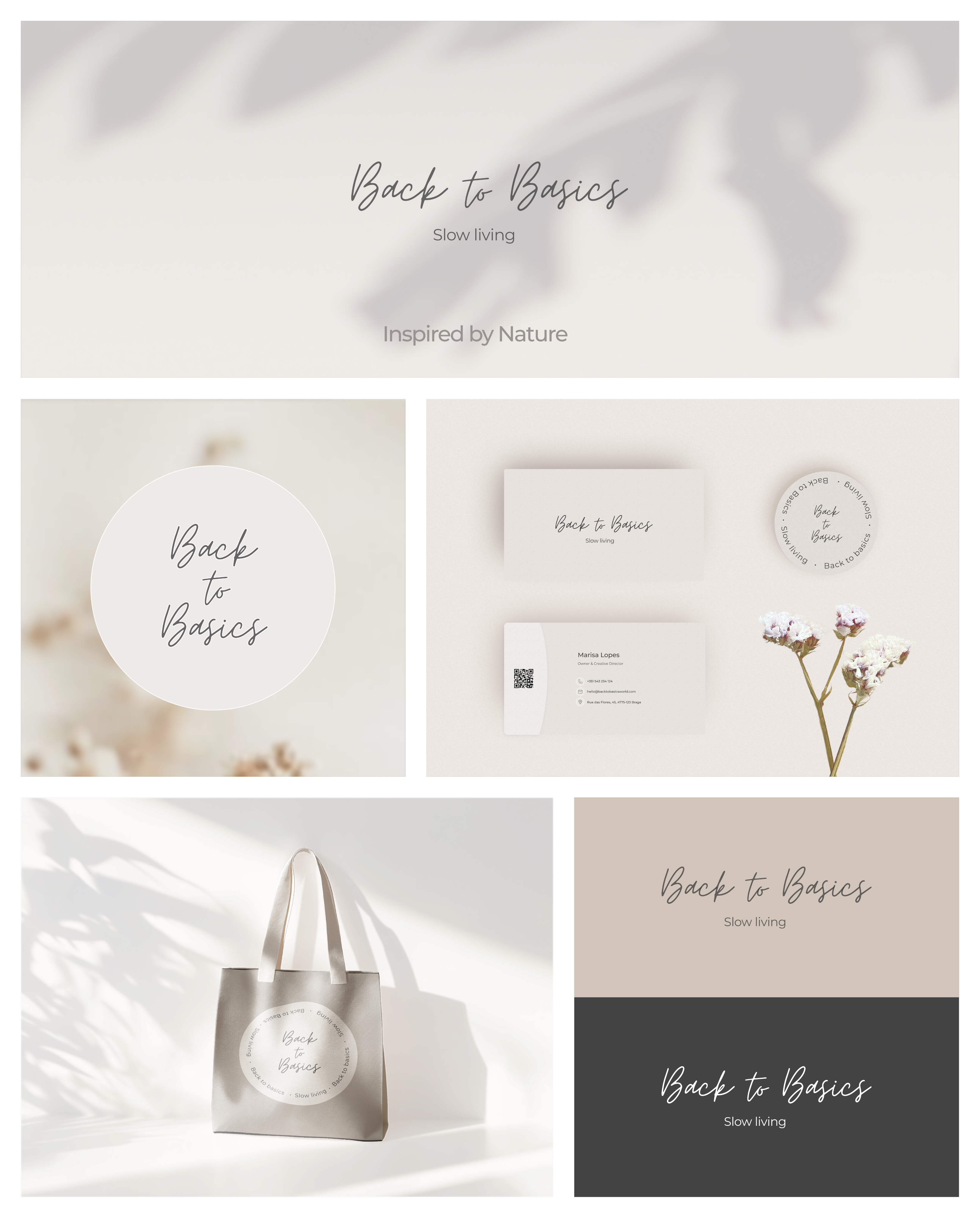
Effortless elegance, elevated details, and enduring beauty.
Back to Basics was born out of the proven need for over 80% of consumers(1) to actively seek brands with genuine and authentic values during the pandemic.
With soft lines and a harmonious colour palette, the branding materials reflect a commitment to quality and intentionality, making it the perfect representation of a lifestyle that values grace and thoughtfulness.
(1) Porter Novelli / Cone - 2021
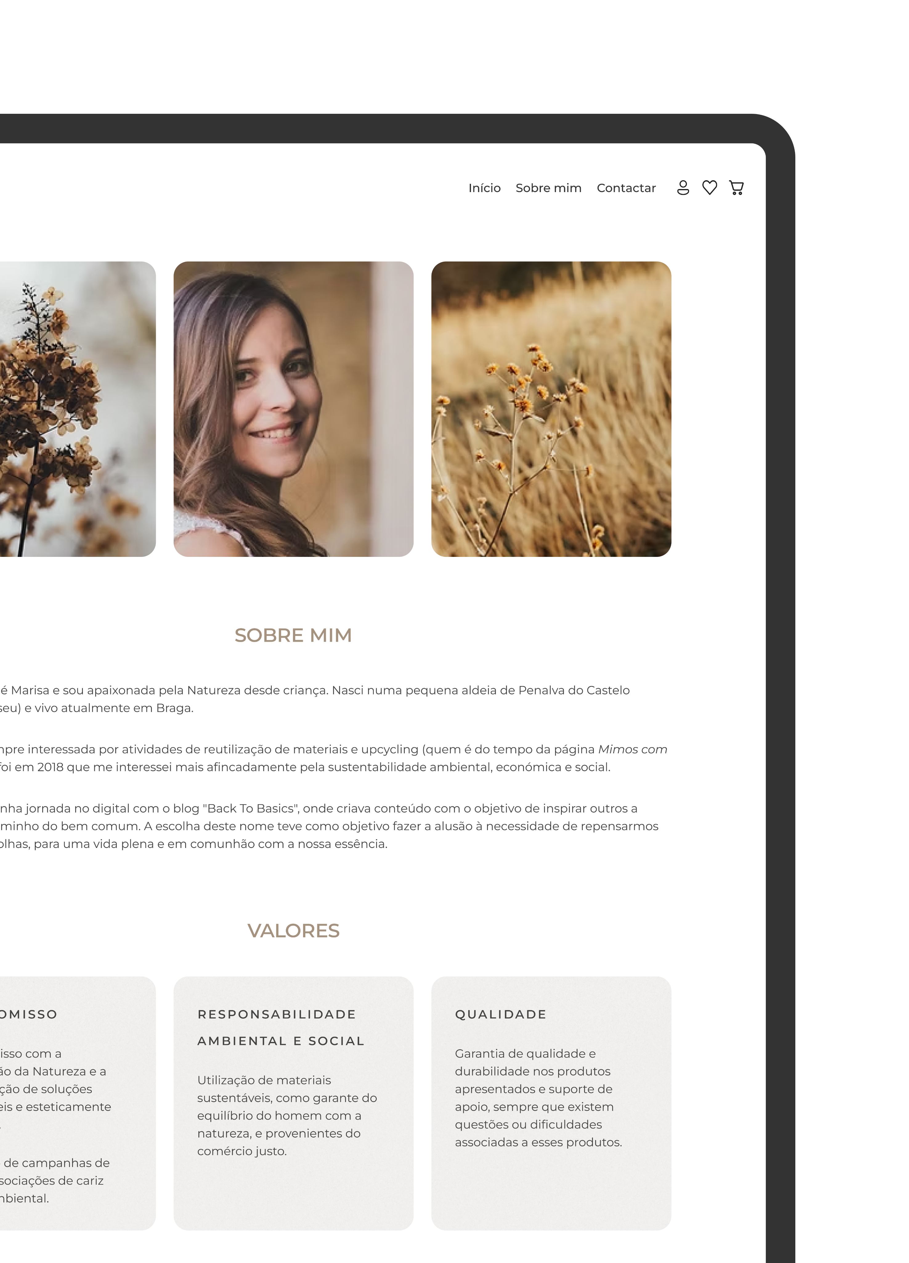
Online store
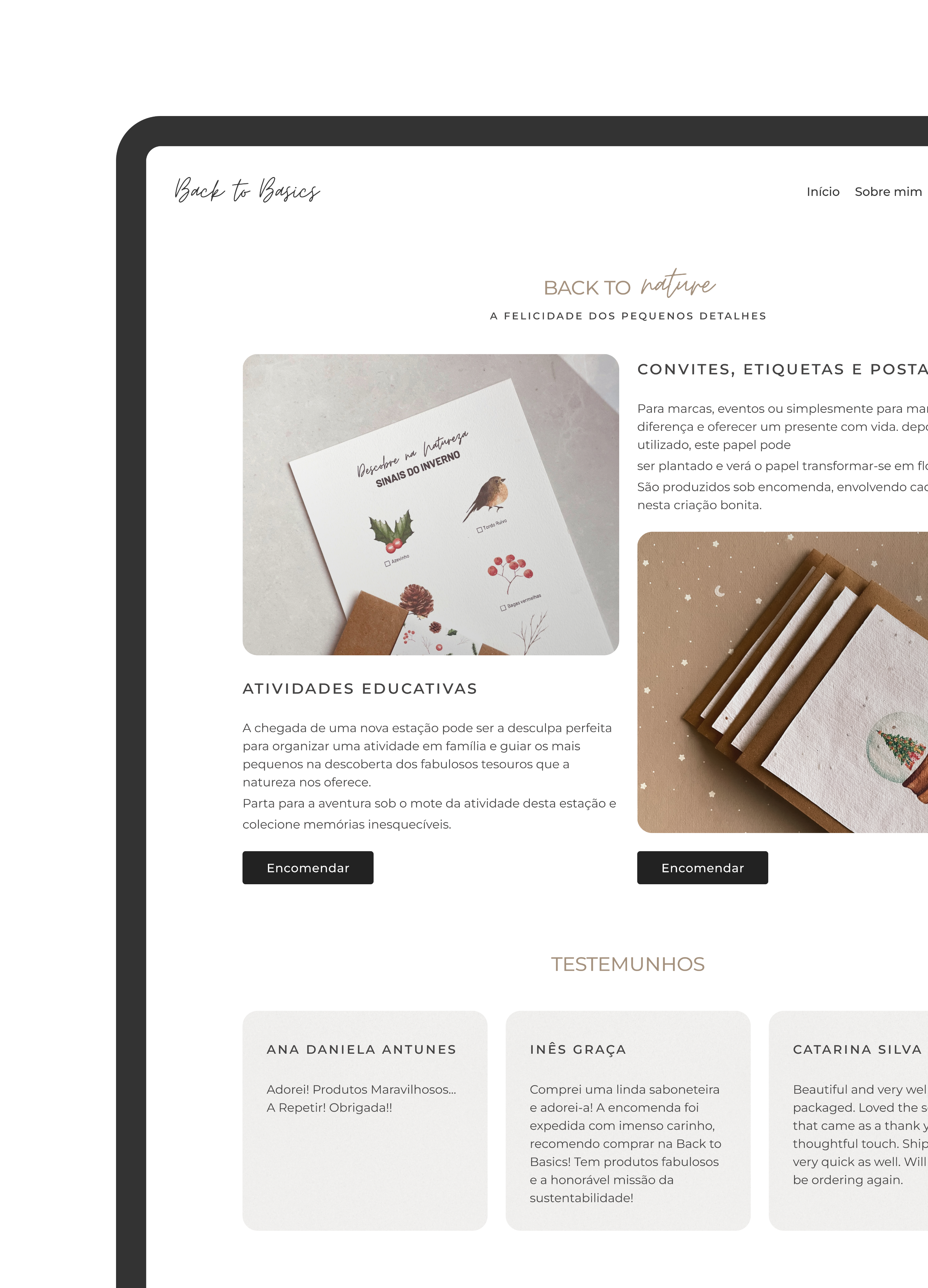
Content that tells a story and shapes the brand experience.
To build trust, connect emotionally and communicate brand values.
Because great design isn’t just about how things look, but how they make us feel.
Elements that capture brand essence and drive engagement.
The brand emerged at a time when screen time reached record levels, resulting in significant digital fatigue. The design of Back to Basics was conceived as a space of empathy and calm, responding to users' desire for more human digital connections(2).
The online store features a sophisticated product listing and detailed product pages, enhancing clarity in browsing and facilitating a seamless transition from exploration to purchase.
(2) Deloitte Global Marketing Trends - 2021
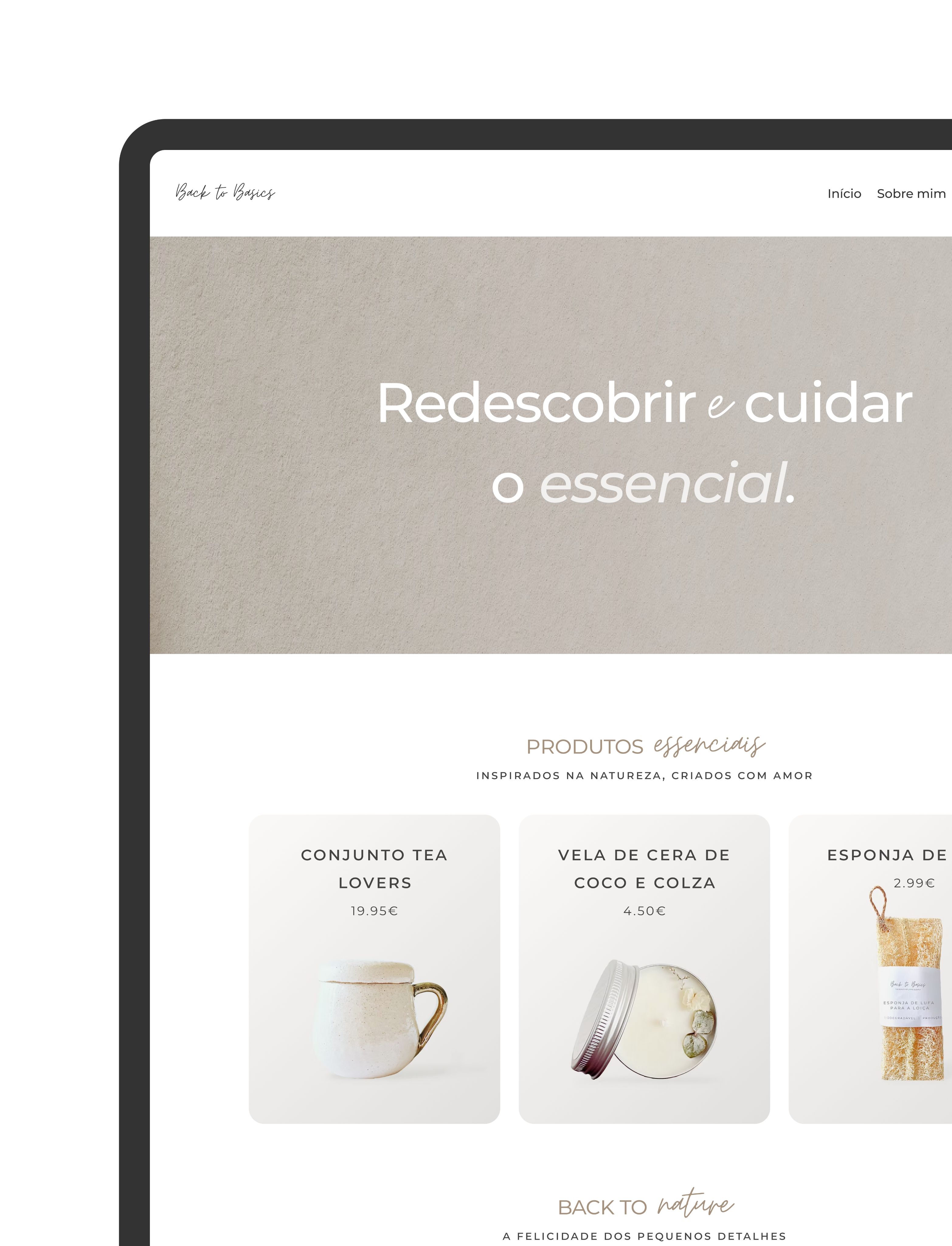
Products collection
Back to Basics focused on providing quality products to the 40% of consumers who embraced conscious consumption during the pandemic(3).
To answer this need, I curated a line of products designed to encourage slowing down.
Studies(1) from that period showed that 86% of consumers preferred to trust and buy from purpose-driven brands, so every item — from handmade ceramics to botanical candles — was chosen to bring nature and calmness back into daily routines.
(1) Porter Novelli, 2021 (3) McKinsey & Company - 2020/2021
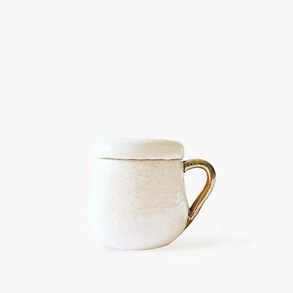
Handmade ceramics
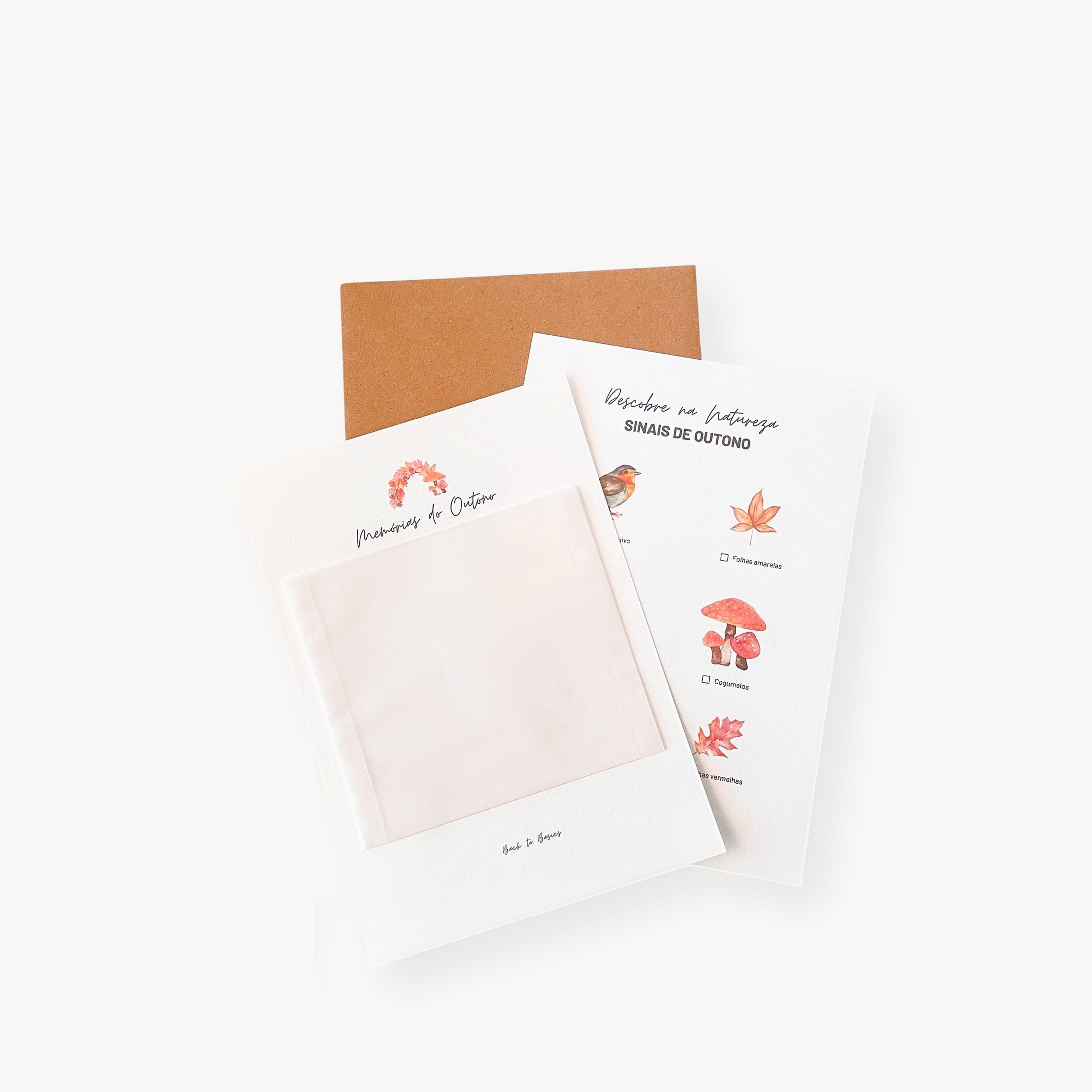
Nature-inspired activities
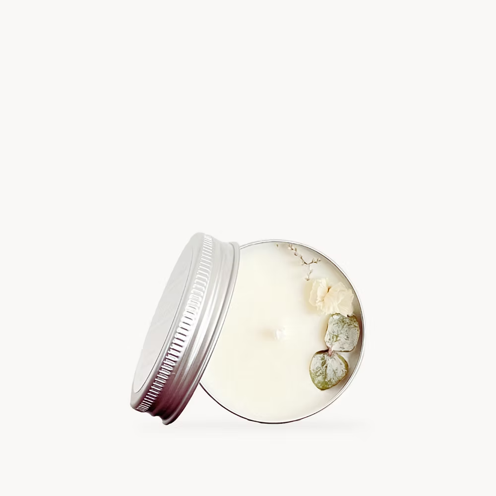
Botanical candles
Outcomes
By creating a calm and minimal online space, the brand was able to build trust and give users a true slow living digital experience.
7min
6 s
Average time
on site
3.6
Avg. pages
per session
The clean, natural design captured users' attention right away.
They didn't leave immediately; instead, they felt invited to click and see more.
Instead of rushing or leaving because of digital fatigue
Users stayed to read the brand story and explore the products peacefully.
Bounce
rate
35 %
A digital retreat...
that successfully turned mindful visitors into a loyal community.
© 2026 Marisa Lopes