Projects
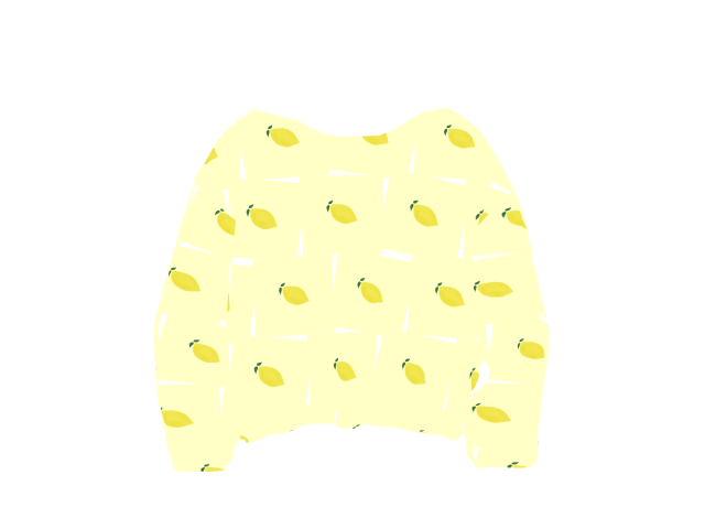
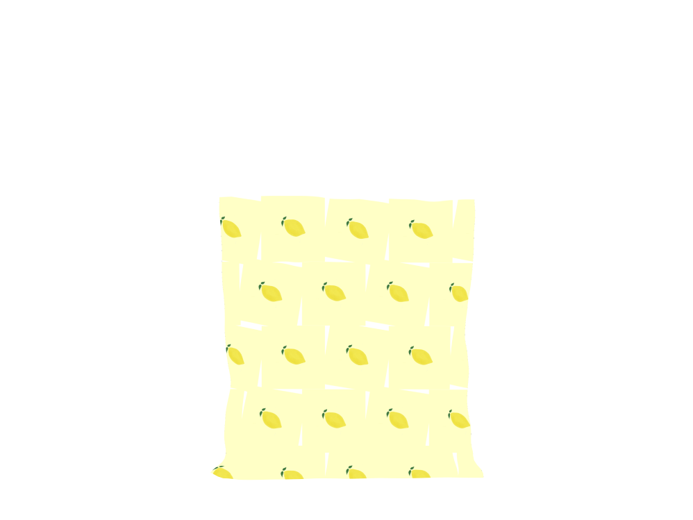
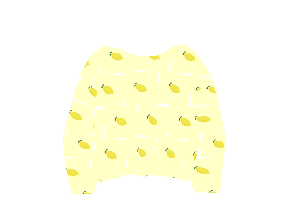
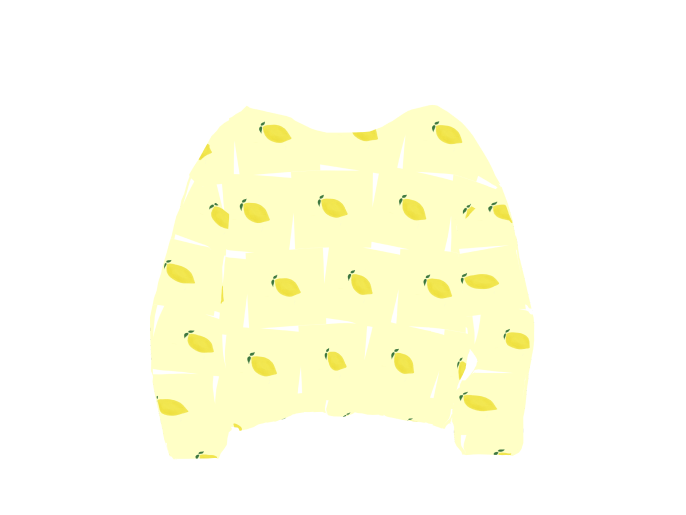
Lemon Curd
•
Digital illustration
Illustration is my way of slowing down the world. It’s a ritual of observation.
It’s about intimacy and vulnerability.
I use my illustrations to explore the delicate balance between reality and fiction, creating visuals that don't just decorate a space, but resonate with the person looking at them.
I seek to turn the ordinary into something worth remembering.
The Lemon Curd pattern brings vibrant energy and a spirited touch to everyday products.
Sunny yellows
Lively greens


Back to Basics
•
Branding 360º
Creating a brand is about creating an emotion.
A memory. A trace.
Since the beginning of my professional journey, what has always driven me is not the commercialisation or the development. It’s the act of creation. Imagining a story. Giving it a soul.
It’s about making people feel.
Brand identity is an art and I used it to create Back to Basics during the pandemic — a brand to encourage a slower, more mindful lifestyle.
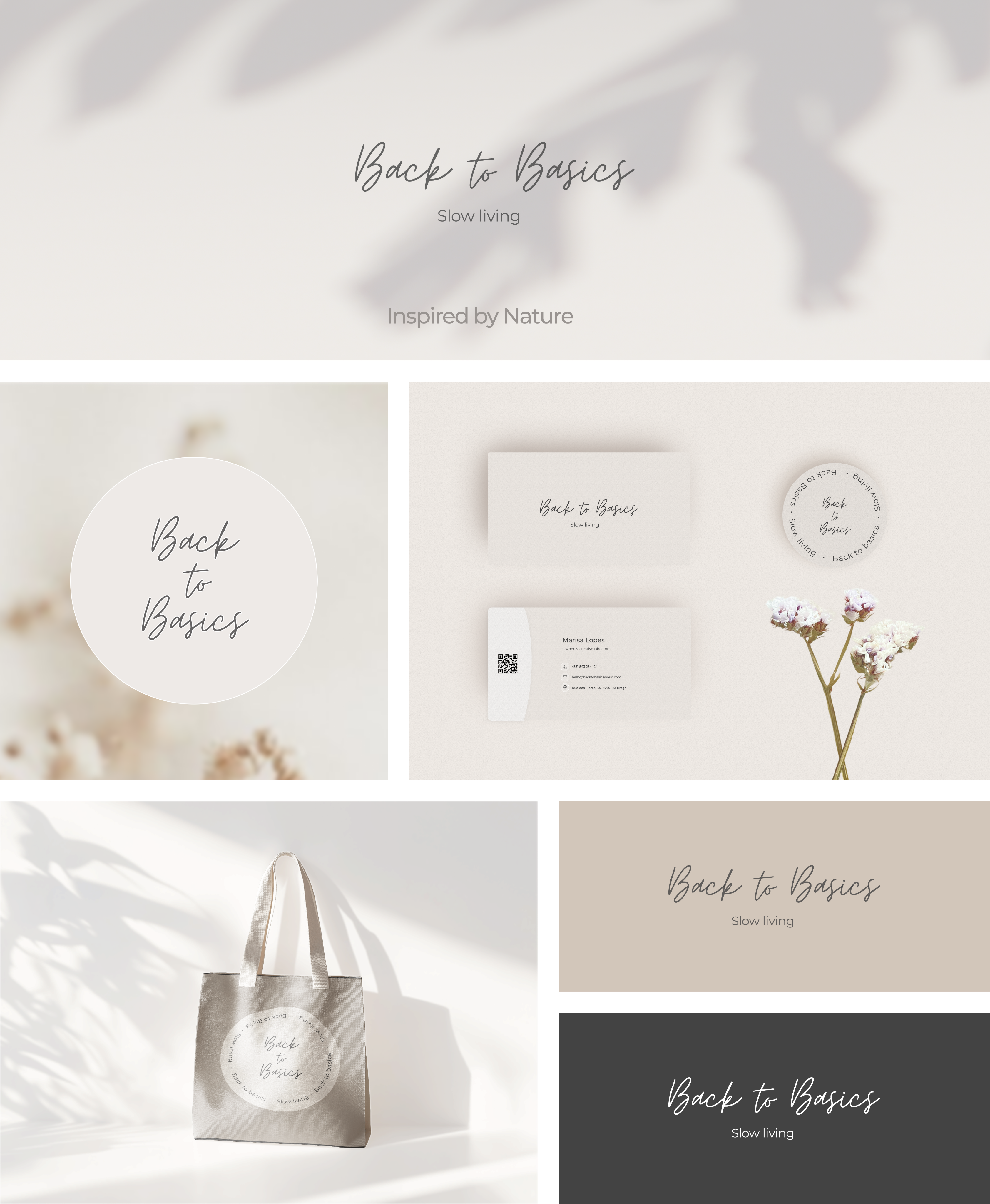
With soft lines and a harmonious colour palette, the branding materials reflect a commitment to quality and intentionality, making it the perfect representation of a lifestyle that values grace and thoughtfulness.

View case study
© 2026 Marisa Lopes